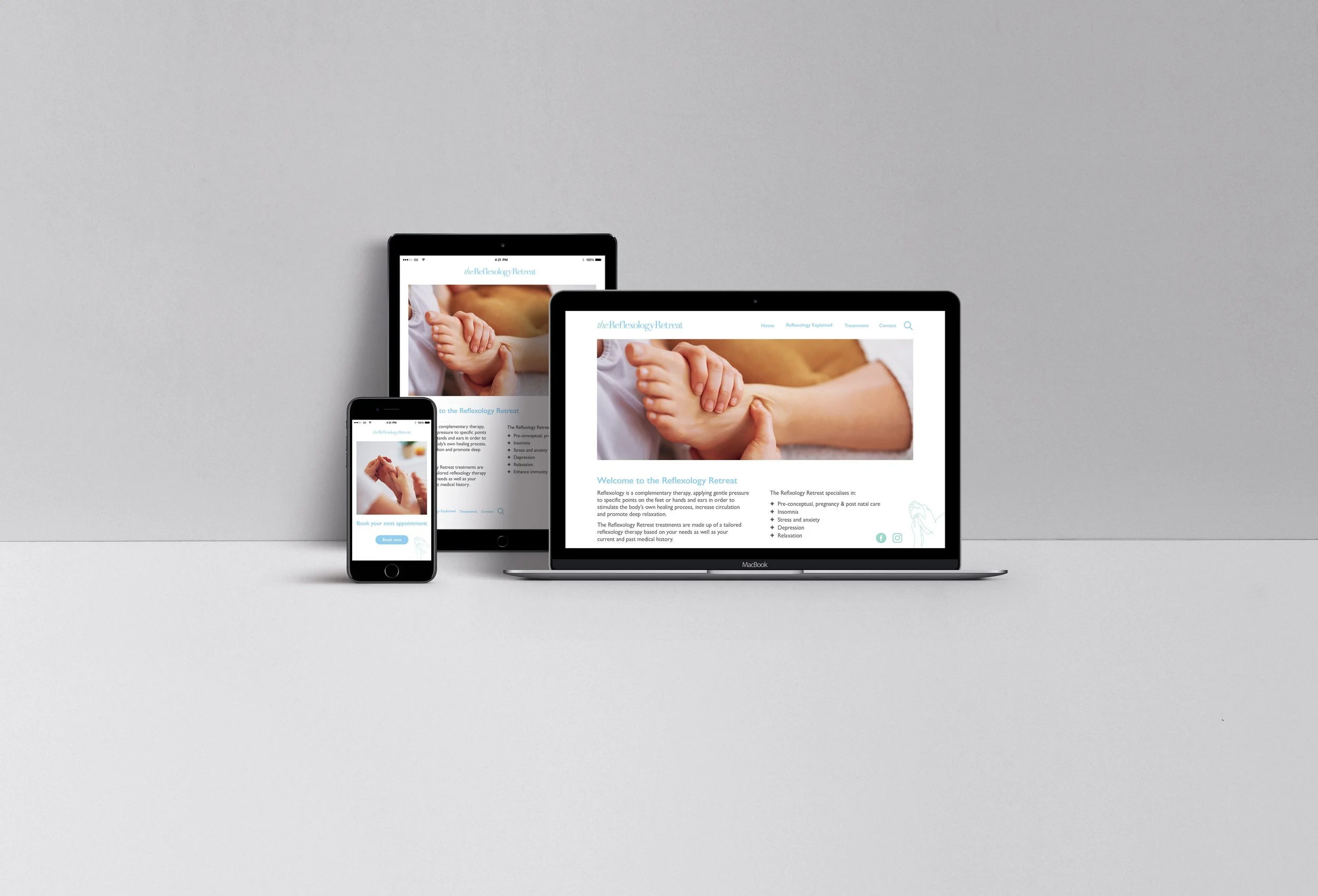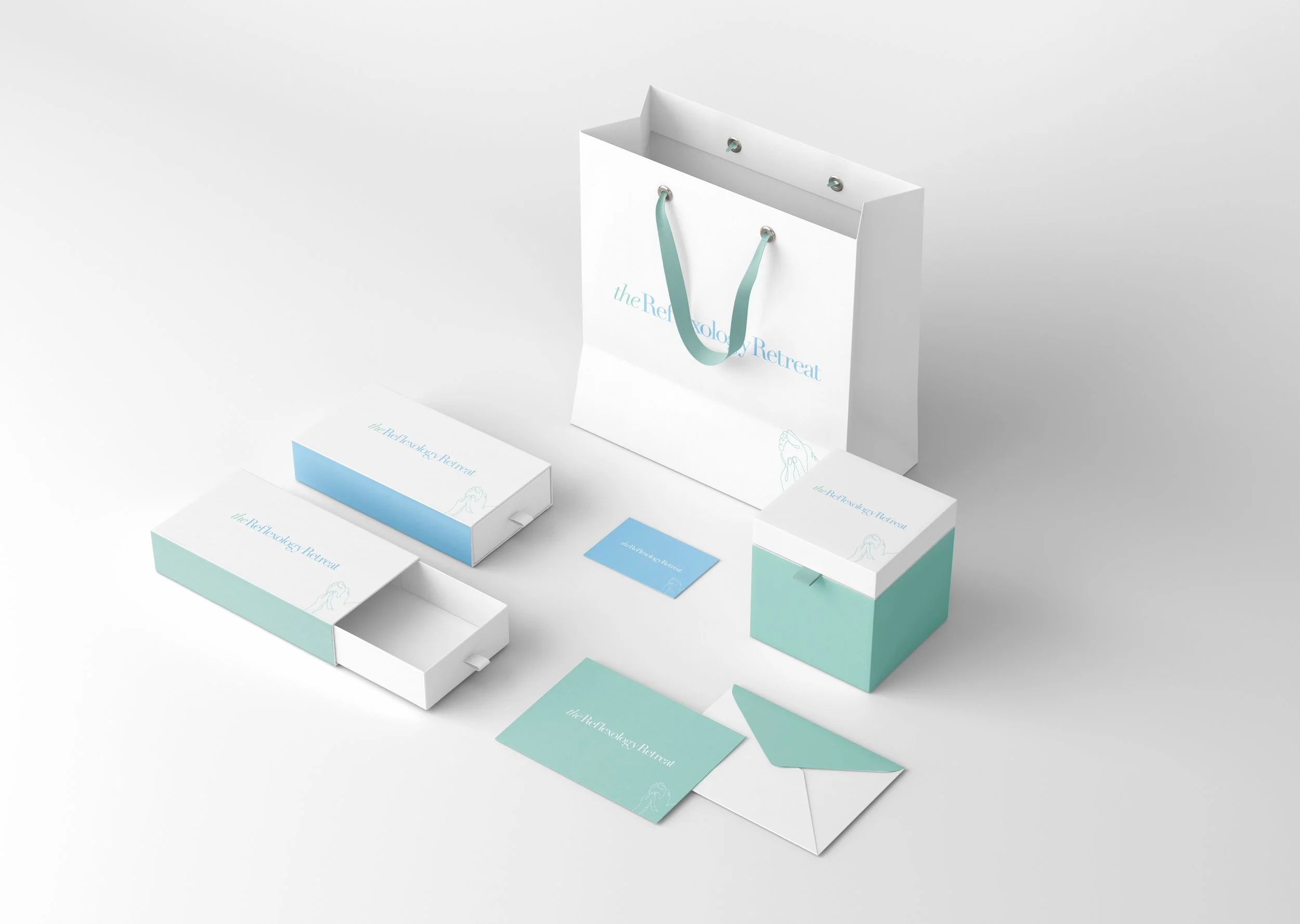
The Reflexology Retreat – Brand Identity
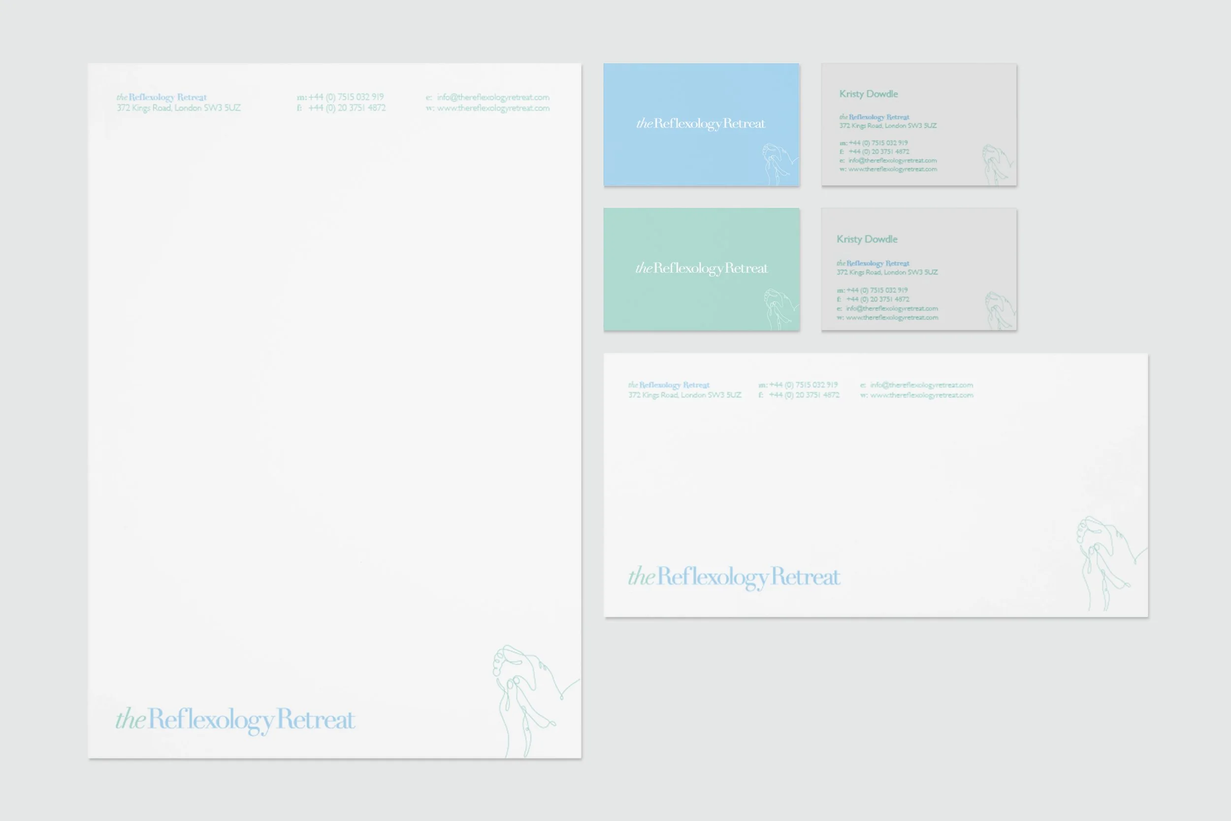
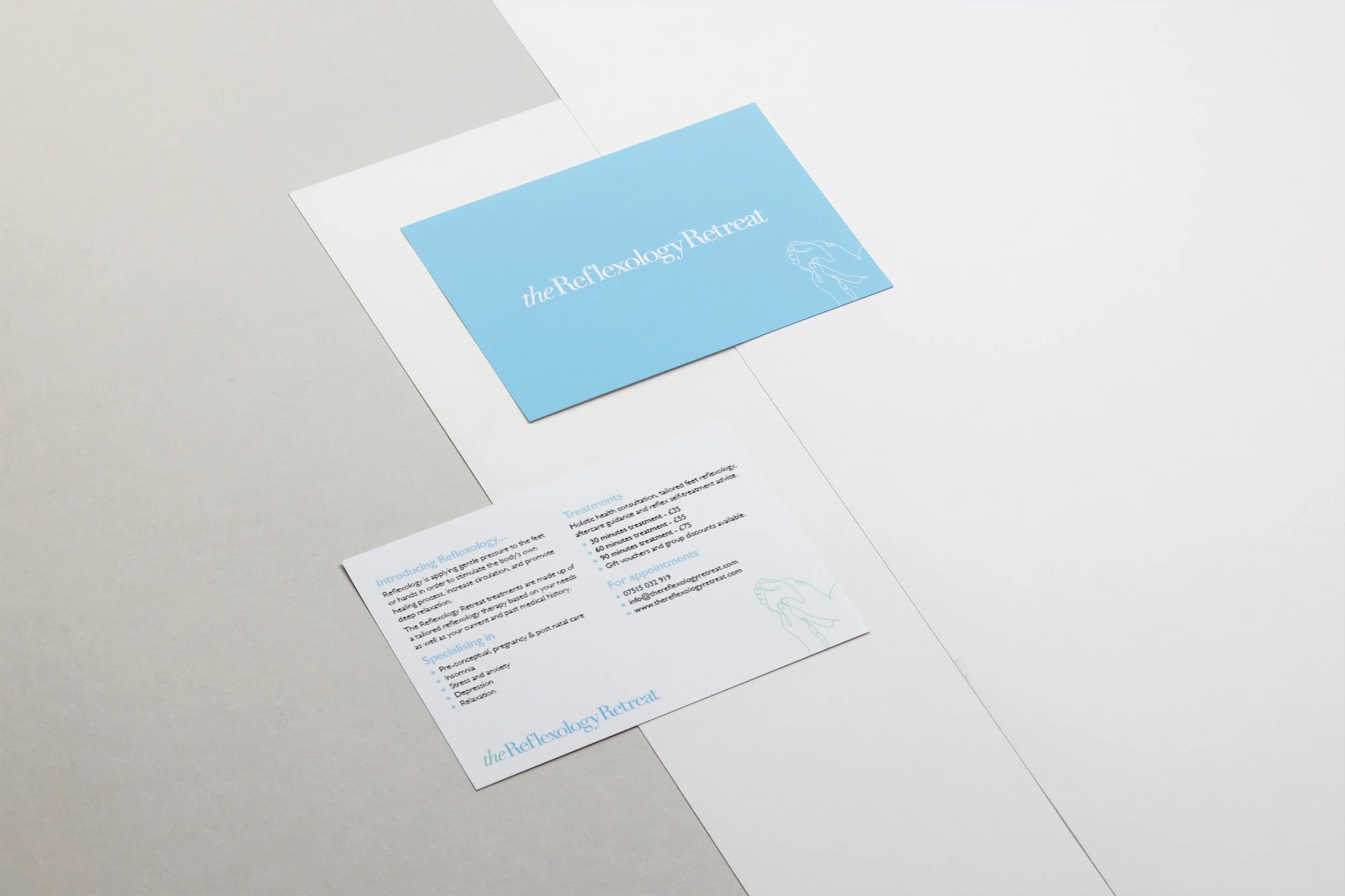
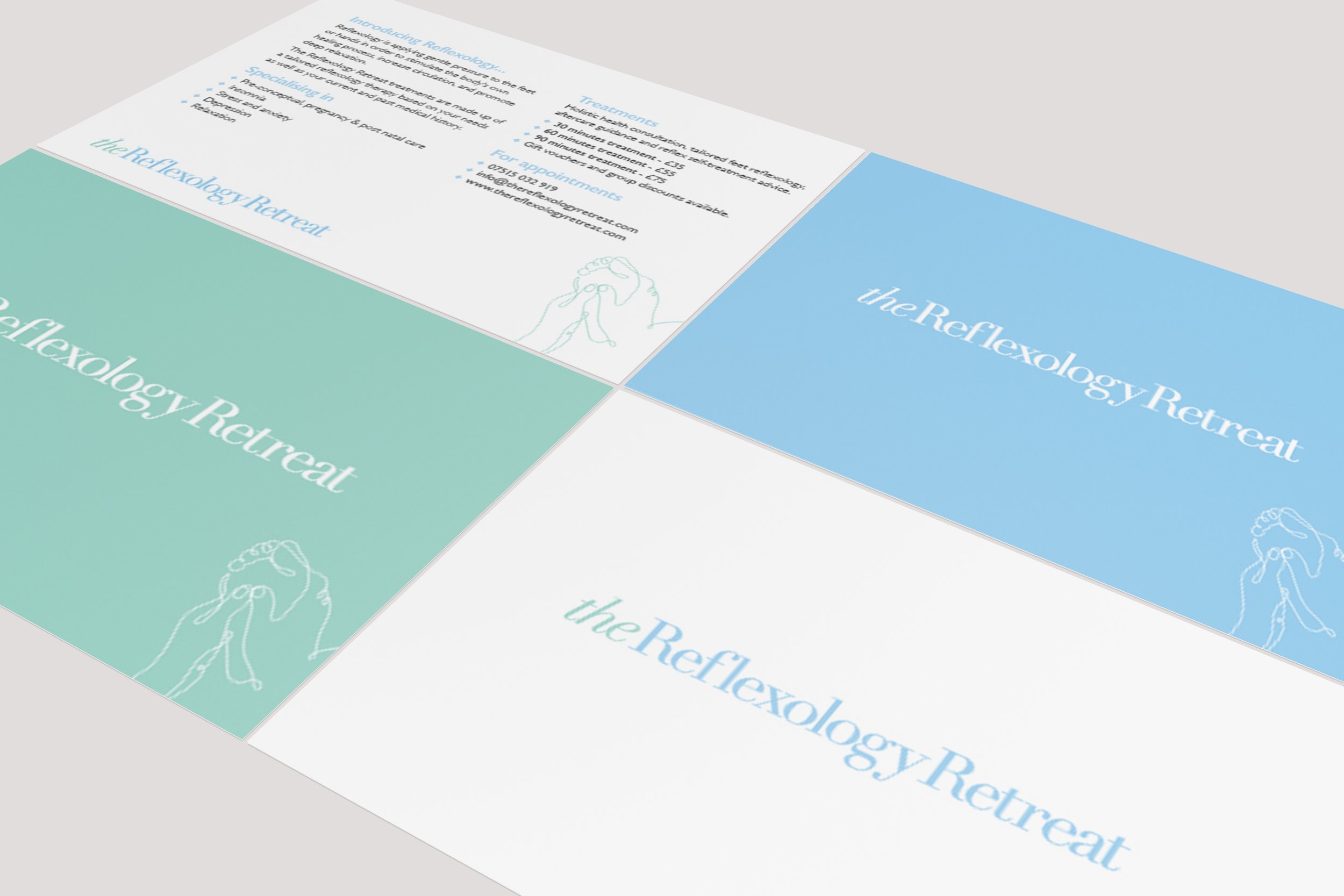
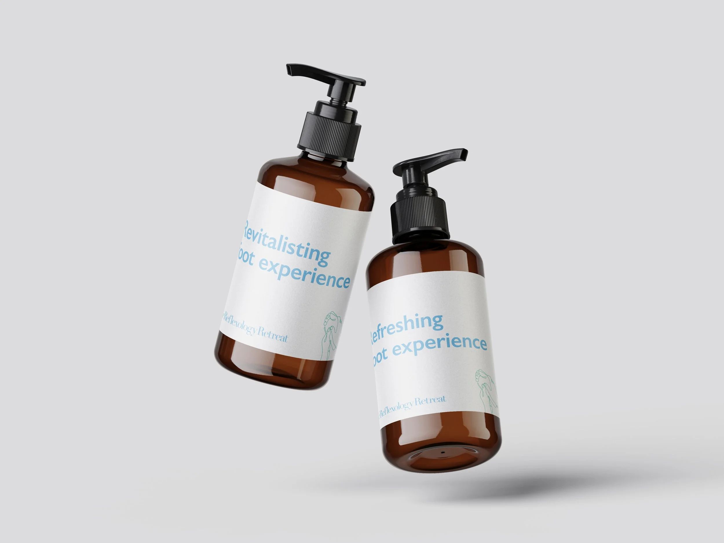
The Reflexology Retreat needed a calming and professional brand identity that reflected its holistic approach to wellbeing. I developed a visual system centred on balance and clarity — from a clean wordmark with hand and foot symbolism to a soft, nature-inspired colour palette and elegant typography.
Working independently, I created a full set of brand guidelines defining logo usage, colour application, and type hierarchy to ensure a consistent look across digital and print materials. The result is a cohesive identity that communicates relaxation, trust, and professionalism, supporting the brand’s growth and credibility within the wellness space.